
Eurovial Lighting
website redesign • UI/UX case study • under development • 2023
overview
Eurovial is a Romanian company that has been distributing electrical components and machinery for over three decades. While Eurovial does have a physical storefront, their primary revenue stream comes from their online shop. This project focuses on improving the experience the latter provides.
my role
As the sole UX designer involved in this project, I was responsible for handling every aspect of the design process from start to finish.
the issue at hand
Eurovial’s online store has an outdated interface and an incohesive user experience. This matter is expected to have a detrimental influence on the company's sales in the long run.
the goal
The goal is to align Eurovial's online shopping experience with the e-commerce experiences of its current market competitors.
project constraints
the customer wanted to work with a realistic user experience, meaning that our feedback sessions had to be run on high-fidelity designs only
time and resources needed for usability testing were not available
the process
User flow-based heuristic evaluation and pain point identification
HMWs
Tracing improved user flows and designing the screens
user flow-based heuristic evaluation and pain point identification
The results of the heuristic evaluation I ran are outlined below:
visual balance
the navigation menu spacing can be misleading and does not prevent navigation errors:
links and buttons not working, thus not facilitating error prevention
some links in the navigation menu were not working
the burger menu icon did not reveal anything else besides what was already being displayed
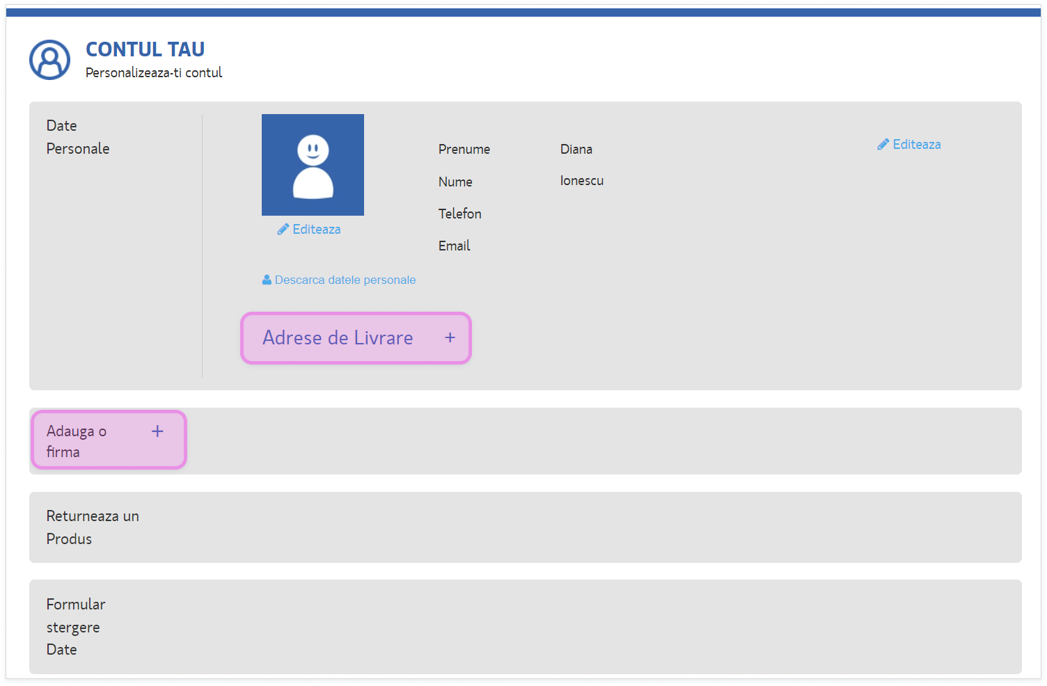
the "user account” button and the “account settings” button (see picture) were essentially the same button but were portrayed as separate

the return process was outdated and complicated
the current return process puts a lot of work on the users and lacks a way of providing prompt feedback: the users are required to print the return form, fill it in, and send it inside the parcel along the item they are looking to return. Such a tedious process may leave the user frustrated and prevent them from ordering from Eurovial Lighting again. I decided to address this issue by making the process fully available online.
disorganized information architecture and inconsistent UI
the user account page, for instance, contains poorly hierarchized information about the user, including billing details, business acquisitions, product returns and personal data deletion form, and uses inconsistent UI elements (such as the “delivery information +” and “business information +” buttons)
while the main navigation bar is composed out of product-centered information (such as “products”, “sales", “outlet” and “photovoltaic panels”) I noticed a significant inconsistency: “Eurovial Lighting’s Services” tab. While one might expect to find items that can be added to the cart, the page's content may surprise them, since it is only a "terms and conditions" article that defines the shipping process and provides delivery information. Since the navigation lacks visibility of system status, I have made visible the tab in the screenshot below.

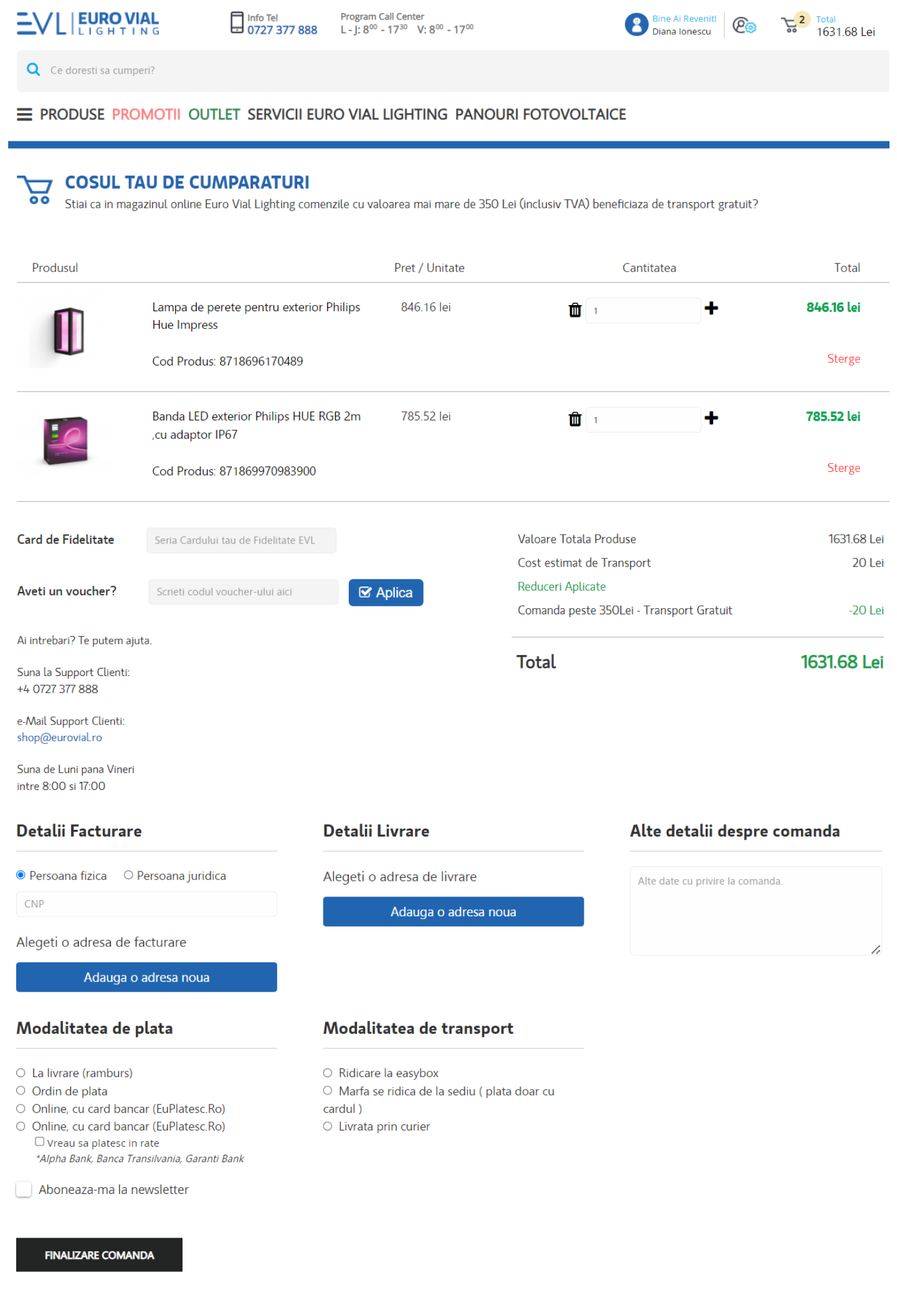
Currently, the layout of the shopping cart has a cluttered overall feel, lacking optimal visual hierarchy and readability.

Old checkout screen
HMWs
A thorough analysis of an outdated website's content provides an opportunity to revisit data that may have been neglected in the past. Existing information can be re-hierarchized and reframed to make it more user-friendly.
I came up with several potential solutions for handling the concerns I highlighted, as well as others of a similar nature:
provide large button target sizes and suitable spacing in accordance with the WCAG
building a consistent and cohesive information architecture
designing a consistent and cohesive UI and building a component library to sustain it
user flows and final designs
user flows
The user flows focus on the primary actions a user might take on this website:
acquisition-oriented actions: searching for a product, having questions about the product and payment and delivery process, adding and removing it from the shopping cart, having the item delivered and having it returned
account-oriented actions: editing profile, changing account settings (basic information, privacy, security), reviewing user activity (viewing orders, returns, adding, removing and editing reviews, etc.), deactivating or deleting account, adding, editing or removing billing and delivery information, etc.
assistance-oriented actions: help and FAQ resources (live chat, over-the-phone consultancy, email-based inquiries, dedicated FAQ pages for several parts of the process)
final designs
Changes:
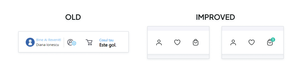
added the USPs to a news ticker located on the top of the screen to facilitate seamless information dissemination among users (Picture 1)
removed the burger icon that did not reveal any further information (Picture 1)
integrated all the main navigation elements in a single section (Picture 1)
provided large button target sizes and suitable spacing in accordance with the WCAG (Picture 1 & 2)

Picture 1

Picture 2
added visibility of system status (Picture 1 & 4)
eliminated IA elements that did not belong (Picture 1 & 3)
removed unnecessary text content and chose to rely on visual feedback instead (Picture 1 & 3)
created a clean, consistent and cohesive visual style
Picture 3 - eliminated UI elements that did not belong, provided visual feedback instead
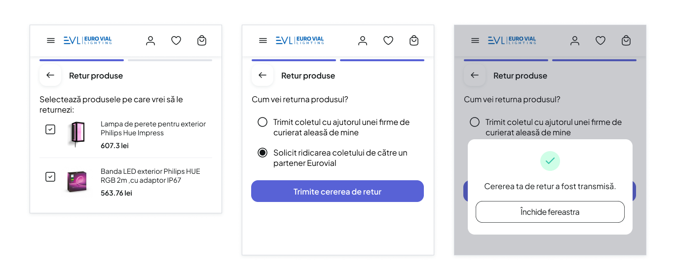
Picture 4 - Visibility of system status: return process (mobile)
choosing products to return, return facilitator, return request confirmation
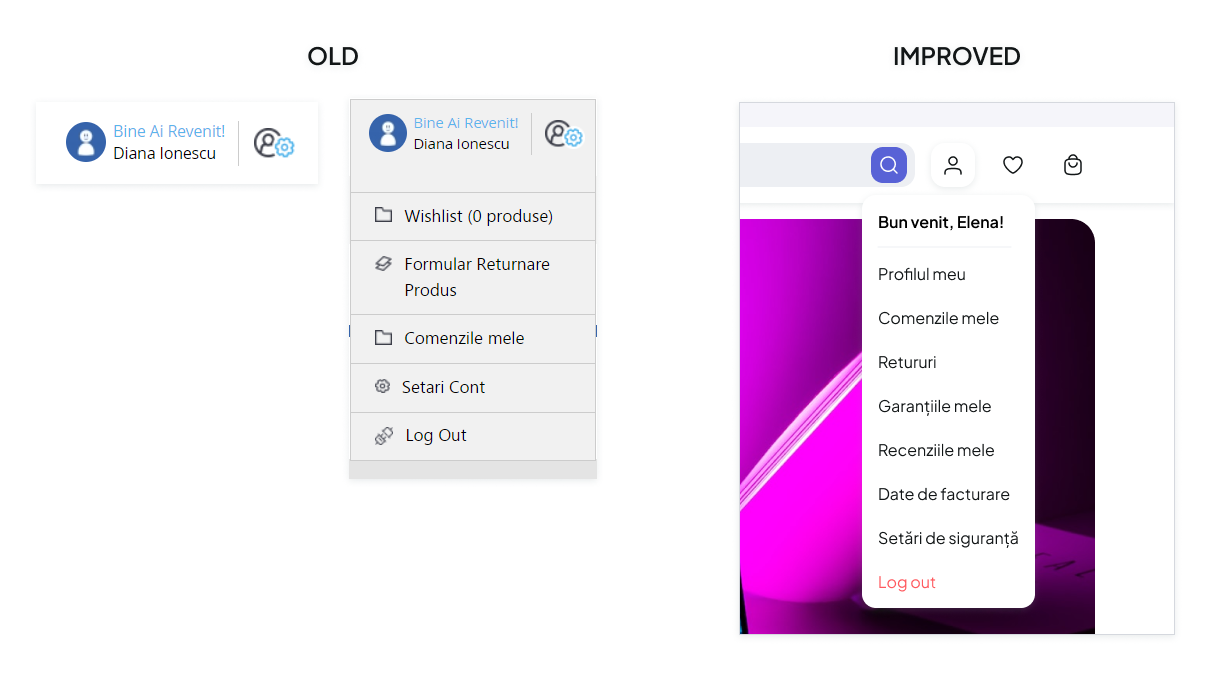
The user account menu's IA has been changed in order to render it more cohesive (see pictures below). The full tree diagram for this particular case is available here.

The shopping cart page used to have an overall cluttered feel, lacking optimal visual hierarchy and readability. For Eurovial, the checkout process serves two purposes: either allowing the user to complete a purchase or requesting the listing of products in the Electronical System of Public Aquisitions (SICAP). The old layout did not provide a clear way for the user to complete the latter. In order to address that, I have changed the information architecture and created two separate flows for each action. See the new IA for the checkout process.
As a reminder, this is the old layout of the checkout screen:
There are two newly introduced flows:
standard checkout flow: this flow shows how both business and non-business (natural person) acquisition are completed
SICAP checkout flow: this flow encompasses the steps that an individual representing a public institution may request the listing of products in the Electronical System of Public Acquisitions (SICAP)
Standard checkout flow

SICAP checkbox: unchecked
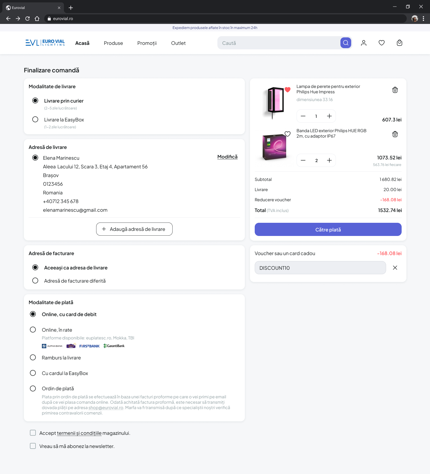
Delivery and billing address selection
SICAP listing request flow
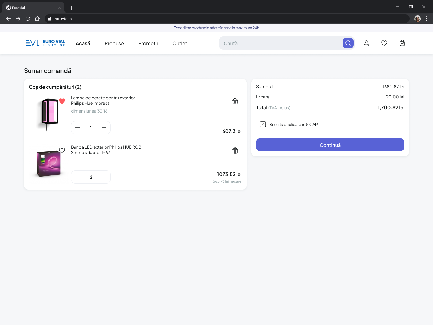
SICAP checkbox: checked
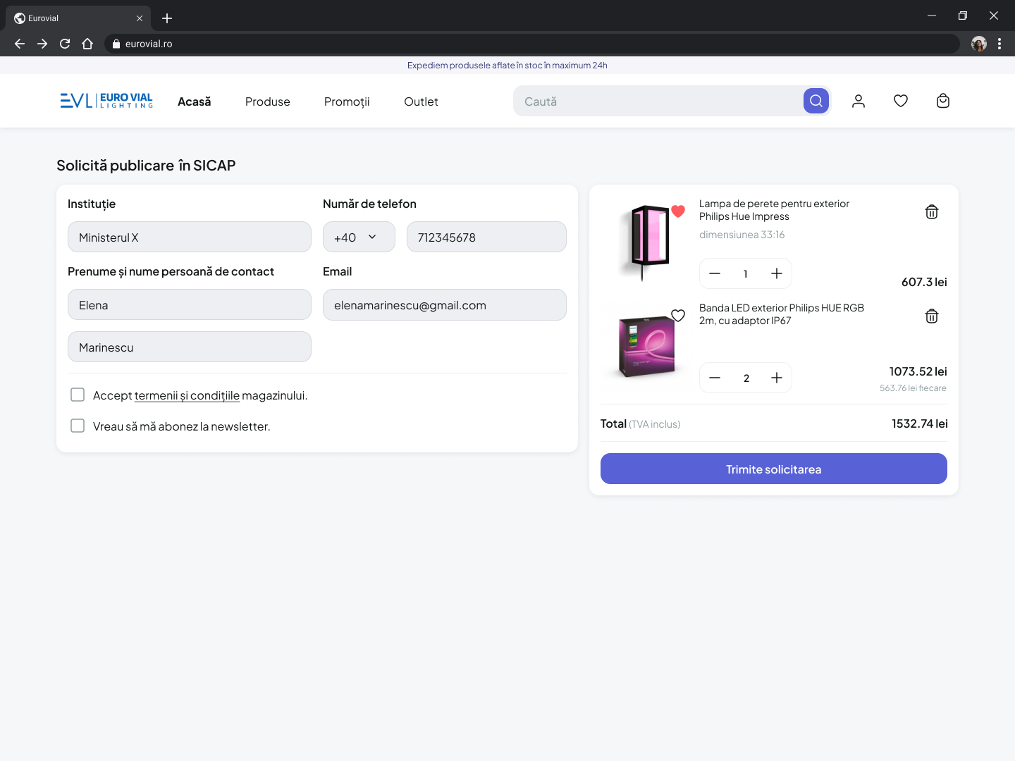
Listing request - personal details
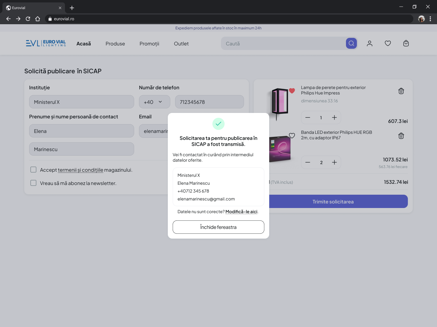
Request confirmation
takeaways & next steps
Currently, all of the changes are under development and will soon be available on the Eurovial Lighting official website. I anticipate that the design changes will bring an improvement in conversion rates as well as a drop in bounce rates. Further research might indicate an overall increase in customer satisfaction with their online experience as well as increased trust from first-time users.
In order to align Eurovial’s updated online experience with their brand identity, I would pursue changes in their logo, tone of voice, and social media presence. A comprehensive approach as such ought to build a cohesive and consistent user experience and prove to be a competitive advantage.
closing thoughts
I believe it would be advantageous for businesses to allocate resources to user testing when choosing whether or not to engage in projects like this one. That, I believe, would substantially help with avoiding the unnecessary expenditure of resources on things that would not offer value to the company in question. This project entirely relied on assumptions and empirical knowledge, and while I acted to the best of my ability, I believe that user testing would have revealed several opportunities for improvement.